
A smooth, intuitive WooCommerce product configurator can dramatically increase conversions on your WooCommerce store. But when the product configurator layout feels overwhelming or confusing, customers may abandon the customization process before finishing their design.
The key to creating a high-converting WooCommerce product configurator layout is visual hierarchy; the design practice of guiding the customer’s eye through thoughtful use of size, color, spacing, contrast, and structure.
You don’t need design or programming skills to apply these principles. Even small visual changes can make your product configurator easier to use and significantly more enjoyable.
10 visual hierarchy tips to achieve higher conversions
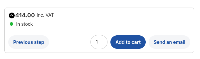
1: Highlight the main action button
In every stage of your WooCommerce product configurator builder, the primary action button should be the most noticeable element on the screen, no matter what it says (“Start Customizing,” “Next Step,” or “Add to Cart”).
Giving it a bold color, a clear shape, and a consistent location helps customers understand exactly what to do next, reducing uncertainty and improving flow.
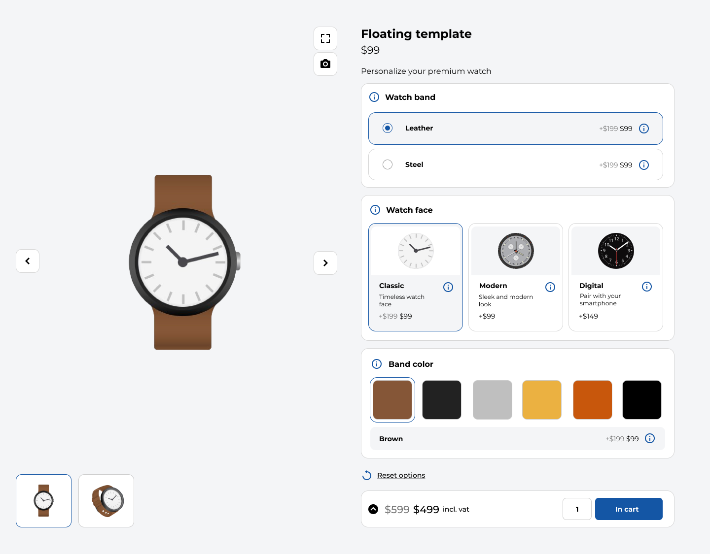
2: Make the product preview the star of the page
The product preview is the heart of your builder. Shoppers want to see how their selections change the look of the item, so the preview should be large, clear, and placed prominently at the top or beside the customization controls.
A strong visual preview builds trust, increases excitement, and reassures customers that they’re creating exactly what they want.
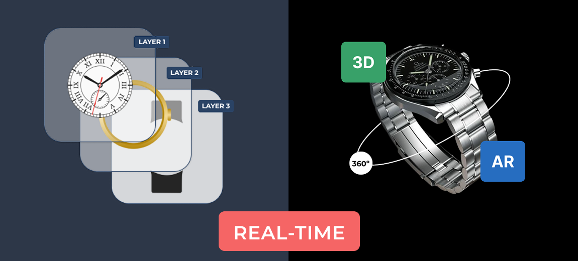
3: Provide real-time preview updates
Whenever customers make a change, the preview should update immediately. Instant feedback creates a smoother, more interactive experience and assures customers that their choices are being applied correctly. Real-time updates also make the builder feel more polished and professional.
The WCB configurator builder plugin comes with pre-built templates that follow these layout principles. Download the plugin and explore the templates.
View templates4: Prioritize essential options over optional add-ons
Not every choice deserves the same amount of attention. Essential selections, such as color, size, or core features, should appear stronger and more noticeable than optional upgrades or decorative add-ons.
When customers can quickly identify the required steps, the customization experience feels simpler and far less overwhelming.
5: Use contrast to show what is selected
Customers should always know which option they have chosen. Clear visual contrast creates instant clarity. Think about highlighted borders, a subtle background shade, or a darker button.
This approach reduces mistakes and makes customers feel more confident about the product they’re building, especially when many variations or styles are available.

6: Use clear and friendly microcopy
Short, helpful explanations can dramatically improve your WooCommerce customization experience. Simple phrases like “required,” “optional upgrade,” “adds to price,” or “tap to see in preview” offer clarity without cluttering the design.
These small pieces of text reduce confusion, speed up decision-making, and help customers feel more supported throughout the process.
7: Guide shoppers with a step-by-step process
Instead of displaying all customization options at once, break the process into simple, logical steps. A step-by-step flow makes even complex products feel manageable.
When customers only see the choices relevant to their current stage, they feel more in control, stay focused, and are less likely to abandon the process.
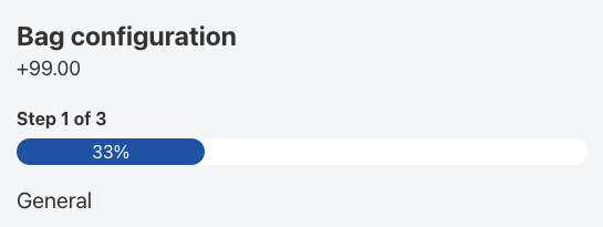
8: Keep a visible progress indicator on the page
A visible progress bar or step indicator helps customers understand where they are in the process, how many steps are left, and how close they are to adding the product to their cart.
This sense of direction is especially important for highly customizable products, as it adds structure and reduces the feeling of being overwhelmed.
9: Prioritize mobile usability
With more than half of e-commerce traffic coming from mobile devices, your product configurator builder must work beautifully on smaller screens. The product visual preview should appear first, followed by clearly organized customization sections that open and close easily.
Buttons should be large enough for comfortable tapping, and the primary action button should remain visible without forcing users to scroll endlessly. A mobile-friendly configurator builder keeps customers engaged and prevents frustration.
10: Use heatmaps and recordings to improve the experience
Tools like Microsoft Clarity and Hotjar reveal how real customers interact with your WooCommerce product builder.
Heatmaps show which elements attract the most attention, while session recordings reveal where customers get stuck, hesitate, or abandon the process.
These insights allow you to make informed improvements that directly increase conversions and reduce friction.
Final thoughts
Improving visual hierarchy doesn’t require coding or complex design skills. It’s simply a matter of arranging your WooCommerce product configurator builder layout in a way that guides customers naturally, reduces confusion, and creates a smooth, enjoyable experience.
When your product builder feels intuitive, customers spend more time customizing, feel confident in their choices, and are far more likely to complete their purchase.